MVP UI Design: What Matters in a First Release?
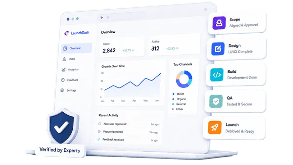
MVP UI design is not a choice between a beautiful product and a rough one. It is the discipline of making the first-release interface clear, consistent, trustworthy, and efficient without spending time on visual work that does not strengthen the product’s core test.
Users do not experience your feature list directly. They experience labels, forms, navigation, feedback, status, spacing, and the sequence of screens. If those elements are confusing, weak activation may look like lack of demand when the real problem is that people could not understand or complete the journey.
The right first-release UI makes important actions and information visible while leaving room for the system to grow after evidence arrives.
Begin After the Core Journey Is Clear
UI design should not be asked to solve an undefined product flow. Before applying detailed colours and typography, confirm the primary user, outcome, screen structure, content needs, and important states.
The MVP UX guide explains how to simplify that journey before the visual layer is finalised.
Use low-fidelity wireframes to answer structural questions:
- What belongs on the screen?
- What is the primary action?
- Which information supports the decision?
- What happens before and after the action?
- What changes for different roles or states?
- How does the path work on mobile?
Once those decisions are credible, UI design can communicate them with hierarchy and consistency.
Establish Clear Visual Hierarchy
Each screen should tell users what matters first.
Use size, weight, spacing, colour, and placement to distinguish:
- Page purpose
- Current status
- Primary action
- Secondary action
- Supporting information
- Destructive action
- Feedback and errors
Avoid making every card, heading, and button equally prominent. When everything demands attention, users must interpret the layout instead of progressing through the task.
Keep the number of prominent actions proportionate to the screen. If several buttons all look primary, return to the product decision and choose which action best supports the journey.
Create a Small, Reusable UI System
A first release benefits from consistency even when it does not need an extensive design system.
Define practical rules for:
- Type scale and text styles
- Colour roles
- Spacing
- Buttons and links
- Form controls
- Navigation
- Cards or list rows
- Alerts and status
- Dialogs
- Icons
- Surface and border treatments
Build components from actual screens rather than predicting every future variation. Reuse the same pattern for the same action across the product.
For each interactive component, define relevant states such as:
- Default
- Hover
- Keyboard focus
- Active or selected
- Disabled
- Loading
- Error
- Success
A button design without focus, loading, or disabled behaviour is not fully specified for development.
Use Colour as a Role, Not Decoration
Create named colour roles such as primary action, text, muted text, border, background, success, warning, and error. This is more maintainable than assigning unrelated colour values screen by screen.
Do not rely on colour alone to communicate state. Pair it with text, an icon, position, or another cue so meaning remains available to users who do not perceive the colour difference.
Reserve strong colours for moments that need attention. If the interface uses the brand accent on every border, icon, and heading, the primary action loses emphasis.
Check text and component contrast during design. The W3C WCAG 2.2 quick reference provides the relevant criteria for contrast, focus visibility, keyboard access, target size, labels, errors, and other interface behaviours.
Make Forms Understandable
Forms are often where MVP journeys succeed or fail. Design them around the information users have and the decisions they understand.
Use:
- Persistent visible labels
- Helpful examples only where needed
- Logical field grouping
- Appropriate input types
- Clear required and optional indicators
- In-context validation
- Specific error messages
- Preserved valid input
- A clear submit outcome
Avoid disabled primary buttons with no explanation. If submission is unavailable, show what the user must correct.
For long processes, communicate progress and let users understand whether they can safely leave and return. Do not divide a simple form into many steps merely to make each screen look lighter.
Design Feedback for Every Important Action
After users act, the interface should acknowledge what happened.
Define feedback for:
- Saving
- Uploading
- Submitting
- Sending
- Deleting
- Inviting
- Processing
- Completing
- Failing
Use loading indicators when an action takes time, but avoid indefinite motion with no explanation. If work continues in the background, say so and explain where the result will appear.
Success feedback should confirm the outcome and next step. “Saved” may be enough for a small edit; a booking or payment requires a more explicit summary.
For destructive actions, make the consequence clear and use confirmation when the result is difficult to reverse.
Include Empty, Error, and Permission States
A populated screen is only one version of the interface.
Empty states
Explain why there is no content and offer the appropriate next action. A new user should not face an unexplained blank dashboard.
Error states
Use plain language, preserve progress where possible, and provide a recovery action. Technical codes can be included for support without replacing the human explanation.
Permission states
Tell users whether they need a different role, an approval, or help from an administrator. Do not simply hide necessary context and leave them guessing.
Partial data
Design for missing images, long names, delayed results, and incomplete profiles. Real data rarely matches ideal mockups.
The MVP wireframe guide helps expose these conditions before detailed UI work begins.
Design Responsive Behaviour Deliberately
Responsive UI is more than scaling dimensions.
Decide how:
- Navigation changes
- Multiple columns stack
- Tables remain usable
- Filters and side panels open
- Persistent actions behave
- Dialogs fit
- Long content wraps
- Touch targets are spaced
- Forms preserve context
Prioritise the core journey on the smallest expected screen. Secondary information can move or collapse, but necessary actions and feedback must remain discoverable.
Test with real content and browser zoom. A design that works only at one artboard size is not ready for a responsive build.
Use Familiar Patterns Where They Help
An MVP usually benefits from conventions users already understand: underlined or recognisable links, standard form controls, predictable navigation, and common status patterns.
Innovation should serve the product’s core value, not make basic interaction a learning exercise. A novel control may look distinctive but create uncertainty that obscures the behaviour you are trying to validate.
Use icons with labels when the meaning is not universally understood. Tooltips can supplement an interface, but essential instructions should not depend on hovering.
Build Trust Proportionate to the Product
Trust requirements differ. A private pilot for a small internal team is not the same as a public financial or health-related product.
Still, first-release UI should feel deliberate. Check:
- Consistent terminology
- Accurate status and confirmation
- Clear data-use explanations where relevant
- Visible support or contact routes
- No broken or placeholder content
- Honest capability descriptions
- Appropriate privacy and consent information
- Professional error handling
Trust is weakened when a product looks finished but behaves unpredictably. Reliable feedback and clear recovery often matter more than decorative animation.
What Can Usually Wait
Some visual enhancements may belong after the first release:
| Prioritise now | Consider later |
|---|---|
| Clear hierarchy | Elaborate illustration system |
| Reusable core components | Large component catalogue |
| Responsive core journey | Rare future layouts |
| Loading, empty and error states | Decorative transitions |
| Accessible colour and focus | Multiple visual themes |
| Realistic content | Extensive marketing animation |
| Consistent basic branding | Full brand expansion |
The decision still depends on the product. A creative tool may require richer interaction than an internal operations form. The test is whether the UI work supports comprehension, trust, differentiation necessary for the first users, or the main validation goal.
Review the Implemented Interface
Design review should continue after development starts. Inspect working screens across supported viewport sizes and input methods.
Confirm:
- Hierarchy matches the intended journey
- Components behave consistently
- Text and data fit
- Focus is visible
- Keyboard order is logical
- Errors are understandable
- Loading does not block users without feedback
- Mobile controls are usable
- Empty and permission states exist
- Analytics events align with the core actions
Do not reduce review to pixel matching. The implemented behaviour is the experience.
Make the First Release Easy to Understand
The UI for an MVP does not need to predict the mature product. It needs to communicate the current product honestly and clearly.
Prioritise hierarchy, consistent components, readable content, accessible interaction, responsive behaviour, and feedback for real states. Postpone decorative breadth that does not improve the core test.
When users can recognise what to do, complete the journey, and understand the result, the MVP can produce stronger evidence about the idea itself.
Design a First Release Users Can Trust
MVPHUB helps founders connect focused UX, clear interface decisions, and professional engineering in one practical MVP delivery path.
Book a free consultation with MVPHUBFrequently Asked Questions
How polished should an MVP UI be?
An MVP UI should be clear, consistent, responsive, accessible, and appropriate for the trust required by its use case. It does not need every decorative flourish or a large design system, but users should be able to understand actions, status, errors, and outcomes.
What UI components does an MVP need?
The required set depends on the core journey, but common needs include buttons, links, form controls, navigation, cards or rows, status messages, alerts, loading indicators, empty states, and dialogs. Build only components that support real first-release screens.
Can branding wait until after the MVP?
A complete brand system can often evolve later, but the first release still needs a coherent identity and trustworthy presentation. Define practical typography, colour roles, logo use, imagery, and tone without letting branding work delay essential product validation.
What UI details should not be postponed?
Do not postpone readable text, clear hierarchy, visible focus, keyboard operation, meaningful labels, sufficient contrast, touch-friendly controls, responsive layouts, validation, feedback, and states for loading, empty data, success, and failure.