
MVP Design Process: From Product Idea to Developer Handoff
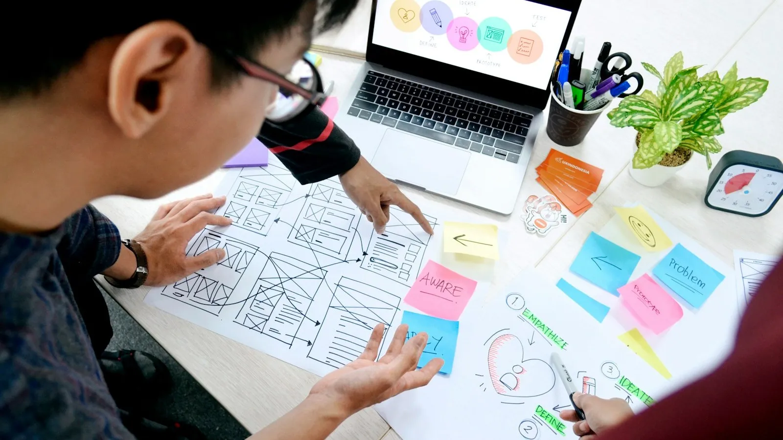
MVP design is the work of turning a product idea into a focused experience that users can understand and developers can build.
It is not simply choosing colours or making polished screens. A useful MVP design process clarifies who the first user is, what they need to accomplish, which screens support that outcome, how the product behaves when something goes wrong, and what evidence the first release should produce.
Skipping these decisions does not remove design work. It pushes that work into development, where choices are more difficult to review and inconsistencies can spread across the product.
Start With the Problem and Learning Goal
Before drawing a screen, write down the problem the MVP is intended to solve. Define the first user segment, their current workaround, the outcome they need, and the business assumption the release must test.
A practical design brief should answer:
- Who is the primary user?
- What event brings them to the product?
- What is the one meaningful outcome they need?
- What behaviour would indicate that the idea deserves further investment?
- Which constraints affect the experience?
- What is explicitly outside the first release?
If the value proposition is still vague, use the MVP value proposition guide before starting interface work. Design cannot make an unclear promise precise on its own.
Define the Core Scope
The next step is turning the product promise into a small set of capabilities. Start from one complete customer journey rather than a list of attractive features.
For a booking product, the essential path might be:
- Choose a service.
- Review availability.
- Select a time.
- provide required details.
- Confirm the booking.
- Receive a clear result.
Every screen and feature should support that path, protect the user, operate the service, or measure the key assumption. The first-release feature guide can help separate required functionality from ideas that belong on the later roadmap.
This is also the point to involve engineering. A short technical review can uncover integration limits, data requirements, permissions, security considerations, and operational steps that affect the design.
Map the User Journey
A user-flow diagram shows how someone moves from entry to outcome. It should include the expected path and the decisions or failures that can interrupt it.
Map:
- Entry points
- Required actions
- Decision branches
- Permission differences
- Empty states
- Validation failures
- System errors
- Cancellation and recovery
- Completion and confirmation
The aim is not to document every possible future feature. It is to make the first-release journey complete enough that users are not left at a dead end.
A simple flow also helps teams notice scope disguised as navigation. If the main outcome requires several dashboards, account types, configuration screens, and approval layers, the MVP may be trying to serve too many scenarios at once.
Create Low-Fidelity Wireframes
Wireframes turn the journey into screen structure. They show what appears on each screen, where the primary action sits, which information has priority, and how users move forward.
Keep early wireframes visually plain. Use real labels and realistic content where wording affects understanding, but avoid spending time on detailed branding before the structure is stable.
Review wireframes for:
- One obvious purpose per screen
- A visible primary action
- Necessary information at the moment it is needed
- Clear navigation and back paths
- Forms that ask only for required data
- Defined empty, loading, success, and error states
- Mobile layouts for the core journey
A founder should be able to explain why every element exists. If an element does not support a user decision or product goal, remove it or move it to a later version.
Build a Clickable Prototype
Connect the key wireframes into a prototype that simulates the core journey. The prototype does not need a real database or production logic. Its purpose is to let people experience the proposed sequence before code is written.
Prototype enough detail to test realistic tasks. Include important branches, confirmation states, and at least the most likely failure path. A perfect happy-path demo can conceal the decisions that make the real product usable.
The distinction between a simulation and working software matters. Prototype vs MVP vs full product explains what evidence each stage can and cannot provide.
Test the Prototype With Target Users
Give participants a realistic task rather than a tour. Ask them to complete the journey while you observe where they hesitate, misinterpret labels, choose the wrong path, or expect information that is missing.
Useful evidence includes:
- Whether the task was completed
- Where help was required
- Which labels caused uncertainty
- Which steps felt unnecessary
- What users expected after an action
- Whether the proposed outcome matched their real workflow
Do not treat positive comments as proof that the design works. Behaviour during the task is more useful than polite approval after a presentation.
Group findings by severity and pattern. Fix problems that block the core journey first, then retest major changes. Minor preferences can be recorded without expanding the first-release scope.
Apply the MVP UI System
Once the structure and flow are credible, define the visual layer. MVP UI design should make hierarchy, actions, status, and feedback easy to understand.
Create a small reusable system for:
- Typography
- Colour roles
- Buttons and links
- Form controls
- Cards and containers
- Navigation
- Alerts and status messages
- Spacing
- Icons
- Focus, hover, disabled, and error states
A consistent system reduces design ambiguity and gives developers repeatable rules. It also makes later changes easier because shared elements can evolve together.
Visual polish should support trust and clarity, but it should not hide unresolved workflow problems. A polished confusing flow is still confusing.
Prepare Responsive and Accessible States
Do not hand off only a desktop happy path. Define how the essential journey behaves on narrow screens and with different amounts of content.
Review text contrast, keyboard order, visible focus, readable labels, touch-target spacing, zoom behaviour, and error messaging. Accessibility is easier to address when it is part of component and interaction decisions rather than a final visual inspection.
Also test realistic content lengths. Names, addresses, descriptions, translated labels, validation messages, and empty datasets can quickly expose layouts that only work with ideal placeholder text.
Create a Developer-Ready Handoff
The handoff is not a moment when designers disappear. It is the point where design decisions become an implementation reference and collaboration continues.
| Handoff item | What it should clarify | Why it matters |
|---|---|---|
| Approved user flow | Entry, decisions, success and recovery | Preserves journey context |
| Screen designs | Desktop and mobile behaviour | Reduces layout guesswork |
| Component set | Reusable elements and states | Supports consistency |
| Interaction notes | What happens after each action | Defines behaviour |
| Content and rules | Labels, validation and permissions | Prevents placeholder logic |
| Edge cases | Empty, loading, error and failure states | Avoids incomplete journeys |
| Priorities | Required now versus later | Protects MVP scope |
| Open questions | Decisions still needing owners | Makes uncertainty visible |
Provide access to the organised source file, assets, fonts or licences where applicable, and the product brief. Use clear naming and connect screens to the relevant flow.
A written MVP brief for non-technical founders complements the visual handoff by explaining users, business rules, priorities, and success measures.
Review During Development
Design review should continue while the product is being built. Developers may uncover technical constraints, missing states, or content cases that were not visible in the prototype.
Review working software at meaningful checkpoints. Compare behaviour, not just pixel similarity. Confirm that the core journey remains clear, responsive, accessible, and aligned with the validation goal.
When a change is necessary, update the shared decision record. Avoid allowing important behaviour to live only in chat messages or meeting memory.
What “Ready for Development” Means
An MVP design is ready for development when the team can explain the primary user, core outcome, screen sequence, interaction rules, content needs, edge cases, responsive behaviour, and first-release boundaries.
It does not mean the product will never change. It means the development team can start from deliberate decisions instead of reconstructing the product from assumptions.
The strongest MVP design process produces three things:
- A focused experience users can test.
- A shared understanding across founders, designers, and developers.
- A build reference that preserves the reason behind each important decision.
Turn Your Product Idea Into a Buildable MVP
MVPHUB helps founders define the core journey, validate product decisions, and prepare a clear path from design to professional development.
Book a free consultation with MVPHUBFrequently Asked Questions
What is the MVP design process?
The MVP design process turns a validated product problem into a clear, testable, and buildable first-release experience. It normally covers scope, user journeys, wireframes, prototype testing, interface design, responsive states, and a structured developer handoff.
Do I need a designer for an MVP?
Not every MVP needs a large design team, but someone must own the user journey, interaction decisions, usability checks, and handoff quality. A founder can contribute product knowledge while an experienced designer or product partner translates it into consistent, testable screens.
Should MVP design happen before development?
The essential journey and major interface decisions should be explored before full development begins. Design and engineering should still collaborate early so technical constraints, data needs, and edge cases shape the proposed experience.
What should a developer handoff include?
A useful handoff includes approved screens, responsive behaviour, reusable components, interaction notes, content, validation rules, empty and error states, user-flow context, priorities, and access to the source design file. Open questions should be visible rather than left for developers to guess.
